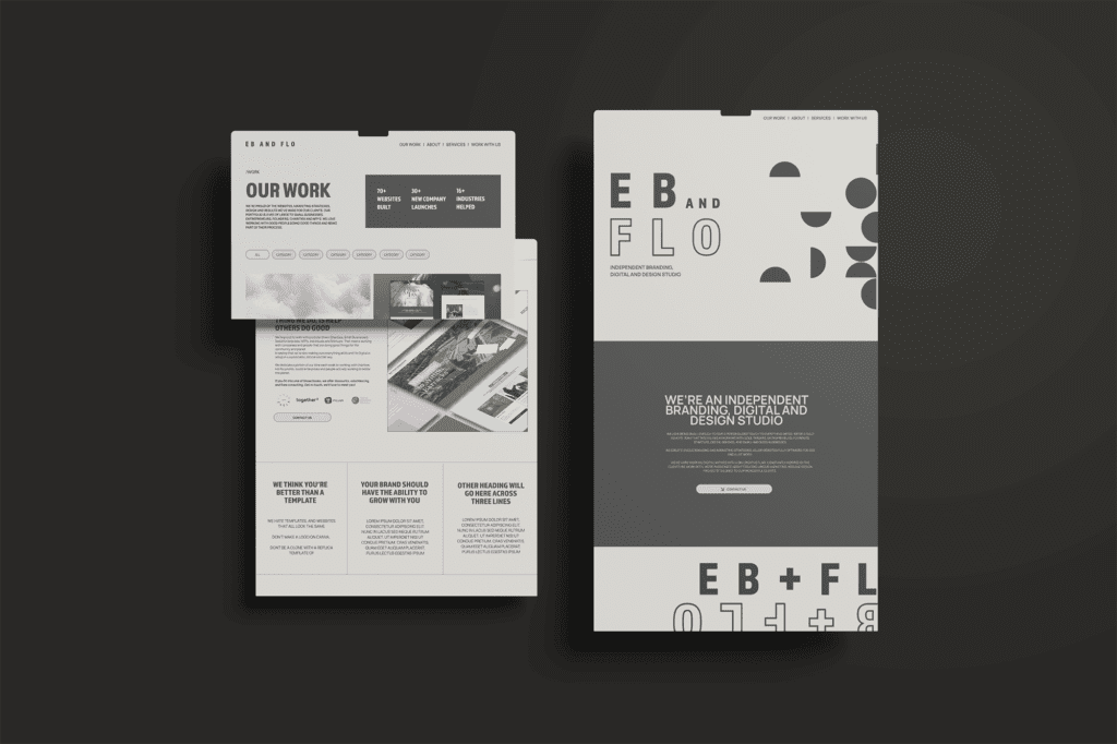
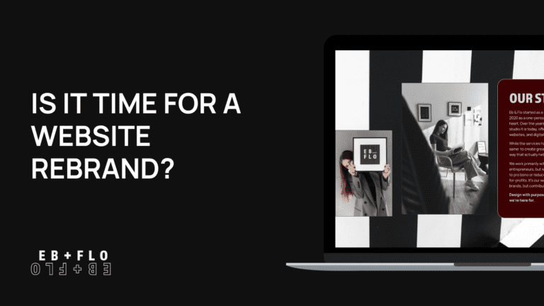
Welcome to Eb and Flo’s new branding!
We believe that your digital presence should reflect your identity, so we thought it was high time we updated ours.
After over four and a half years in business, much has changed for us. We started as just a small marketing agency, but as we grew and matured our focus gradually shifted to also including a wide range of digital design, copywriting and website design services.
OUR MISSION
Our amazing client base is full of open-minded people who do good things. We mainly work with entrepreneurs, small and mid-sized businesses. Additionally, we devote one to two days a week doing pro-bono or reduced-cost work for a mix of charities and not-for-profits, ensuring we’re actively taking steps towards positive change and fulfilling our mission to help and do good.
As a rule, we use a lot of colour and no templates.
The designs we create are sleek, modern and colourful. While we’ve got a defined style of design, we always make sure no two brands are the same.
We aim to bring a contemporary vibe to our clients’ online presence without compromising on quality or taking away from the client’s mission, style or identity. Our goal is to offer people something that lets them stand out, something new and different to the same old designs and templates you see everywhere.
WHY REBRAND NOW?
We wanted all of the above to be reflected in our brand too.
“I’ve wanted to do the rebrand for a while now. As an agency owner, I prioritise my clients and devote my working hours to their projects. As I firmly believe in work-life balance, I found it quite challenging to justify taking a portion of my time to work on my own business. A struggle I know many business owners deal with.
In the end, I had to set a deadline and treat my business as a third-party client. I don’t regret putting in the hours though, I’m happy and proud of Eb and Flo’s new look. It truly shows off who we are and what we stand for as a business,” founder Em says.


WHAT’S NEW?
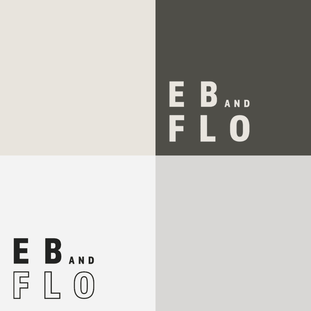
Those of you who know us already will notice that we swapped our bright company colours to more muted and neutral ones. We toned down the purple to a lighter blue-purple as an accent. The reason for this is to put our client’s design at the forefront. Our clients are our pride and joy, and we love to celebrate them, so we felt the spotlight should be on them and make them stand out more than us.
We’ve also changed our domain to ebandflo.com. Short clean domains are easier to find (and type!), a rule we apply when building all our clients’ websites that we thought we should practise ourselves. After winning a tumultuous online bidding battle against an anonymous bidder in the USA, we’re excited to finally be able to change it over in line with the new branding.
Aside from our logo which was well overdue for an update, we’ve refreshed our copy, imagery and other important parts of the brand. We feel it now paints a far more accurate picture of our values, mission and where we are as a matured business.
We’re thrilled to support the amazing clients we already have and to meet many new ones in the years ahead.
“This business has become such a big part of my life. I love growing it, and I’m very excited for the new era of Eb and Flo,” says Em.
We hope you love the new brand as much as we do! Check out our new website and brand here.

