When we say design, we don’t mean just pretty pictures or a cute logo.
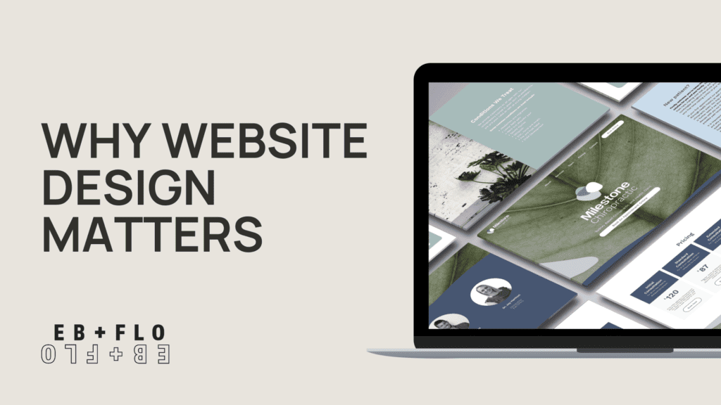
The design of your website encompasses the colours, themes, page structure, and yes, any visuals you may wish to include, be that photos, graphs, videos or illustrations.
This is what users notice first, apart from speed. Doing it well, gives you that chance of gaining that attention we keep talking about. So it is absolutely crucial to think carefully about what you include on your webpage.
Also, as we explained before, it is important to check your design works properly not only on the web but also on mobile and tablet (and hey, don’t forget the extra perk that doing this properly will boost your Google Search Engine ratings).
Visuals hold the power
Imagery of any sort is super important. Apart from using photos or graphics to break up text or make your page look pretty, pictures are very powerful storytelling tools. Remember the old saying, “A picture is worth a thousand words”? That’s exactly the case when it comes to your website.
Think about how quickly you can understand a situation by letting your brain fill in the gaps after seeing a single photograph. A picture tells a story faster than words do.
Imagery evokes emotion. What do you want your audience to feel when they visit each page on your website? Adding the right imagery will create that desired user experience. An hopefully, needless to say, don’t overlook the image quality. If it’s not high-quality, it’s not worth adding at all. It will cause more harm than good when it comes to those first impressions.
There’s an underlying psychology to the whole visual thing. Curiously, people tend to gravitate towards similar things in imagery. For example, they would be more engaged if they saw a picture featuring people as opposed to just scenery.
Colours, colours, colours
There’s an underlying psychology to the whole visual thing. Curiously, people tend to gravitate towards similar things in imagery. For example, they would be more engaged if they saw a picture featuring people as opposed to just scenery. Here are other little tricks you can use: pictures with pets and food tend to get more engagement.
For full information on how people respond to different imagery, you can check this page out [https://trends.taboola.com/]. Keeping in mind the stats above, why not consider including photos of your team, services and products that are visually engaging? Or even office pets if there are any?
User experience, again
Last but not least, the design of your website is central to the user experience. Making sure everything is visible and easy to find makes a huge difference to how visitors perceive your page. Always check that the design is helpful when it comes to navigating the pages within your website and include clear navigation menus and imagery/symbols that point users to the different parts of the website they can visit.
Embark on a journey of digital transformation with Eb + Flo Digital. Whether it’s a stunning website, impactful digital marketing, or captivating content, we’ve got you covered. Reach out today and let’s redefine your online presence!


