Client Overview
Legacy Life Coaching was a concept built around empowerment, clarity, and connection. The brief was to create a calming, feminine brand identity that felt spiritual but grounded, built around earthy teals, neutrals, and sun symbolism. The brand needed to represent balance and light while appealing to clients seeking personal growth and transformation.
Our Goals
- Develop a brand identity that felt aligned, harmonious, and uplifting
- Design a logo using sacred geometry and numerology principles to reflect balance and purpose
- Create a website that felt clean, clear, and spacious, allowing visitors to feel calm and inspired
- Build visual consistency across all brand touchpoints
Our Deliverables
- Branding and logo design
- Website design and build
- Brand colour palette, typography, and style guide
- Brand rollout concepts and social previews
THE PROJECT THAT NEVER WAS…
We went back and forth on whether to share this one. It’s not the usual success story… the project ended on a difficult note, with us being ghosted and never being fully paid for the work. That said, we loved what we created and poured a lot of care into the design and website build.
Even though it never officially launched out into the world… the brand direction remains one of our favourites. We wanted to showcase them here as both a piece of creative work we’re proud of and a reminder of the importance of protecting your business with strong contracts and boundaries.
THE CREATIVE DIRECTION
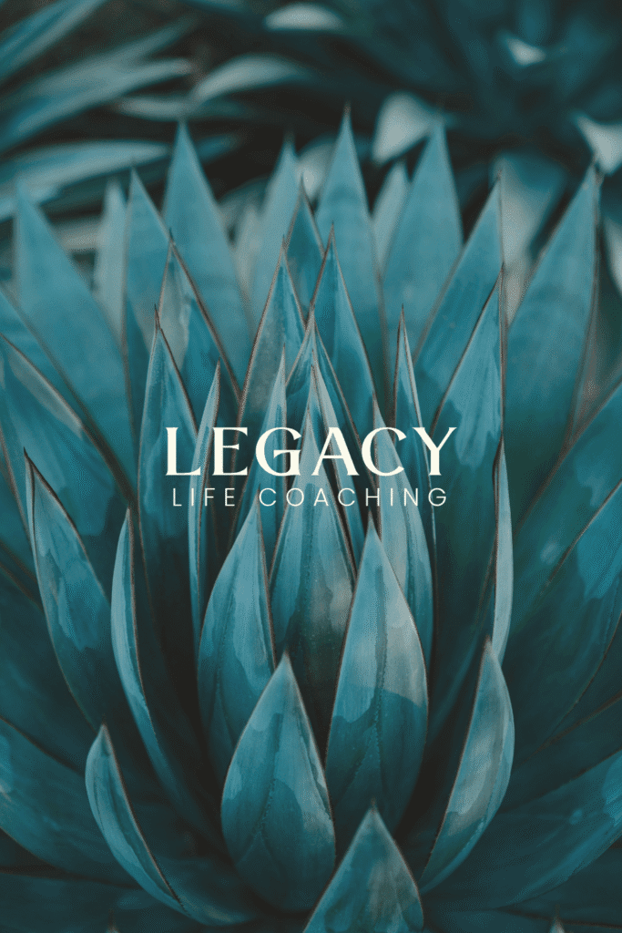
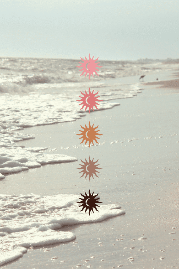
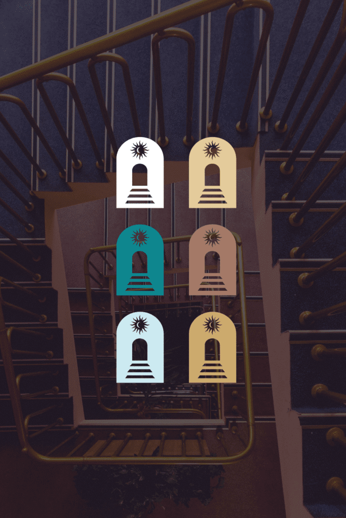
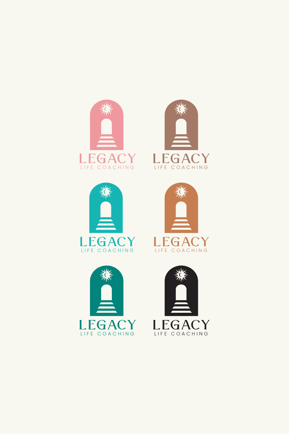
The design process began with an exploration of shapes and symbols tied to balance, alignment, and growth. The client requested that the logo follow sacred geometry and symmetry rules, with each point and circle constructed to represent connection and intention.
We refined these early sketches into a modern sun motif, combining geometric precision with a sense of warmth and light. The palette of teals, sands, and soft neutrals was chosen to evoke calm, while subtle gradients added dimension and energy.
Typography played a key role in maintaining this balance — soft curves paired with confident, structured lettering. The result was a visual identity that felt feminine without being overly delicate, grounded yet aspirational.
The website design extended the same principles of clarity and calm. We focused on spacious layouts and clear hierarchy, ensuring that users could explore content with ease and without distraction.
Each section flowed intentionally into the next, supported by consistent iconography, subtle motion, and a carefully considered colour balance. The overall effect was one of serenity and focus — a digital environment that mirrored the brand’s coaching philosophy.
We built out templates for future blog posts, calls to action, and contact forms to ensure consistency and scalability as the brand grew. Accessibility and responsive design were front of mind, ensuring the experience translated seamlessly across devices.
A YEAR IN THE MAKING
This project spanned nearly twelve months of collaboration, development, and refinement. From early logo sketches to finalised design systems, every step was taken with care and attention to detail.
Even though the project was never officially launched, it represents a significant body of creative work that reflects our design values — intentionality, precision, and meaning. It also reinforced how much a well-documented process can protect and support designers when outcomes shift unexpectedly.

WHAT WE LEARNED
This experience highlighted the importance of having solid legal frameworks in place to protect creative work and ensure fair partnerships. As a studio, we’ve since strengthened our onboarding process, contract clarity, and client vetting approach.
It’s never easy when a project doesn’t see the light of day, but every experience adds to the foundation of how we work and who we choose to work with.
We’re proud of this project and wanted to share it both as a creative showcase and a reflection on professional growth. Beautiful design deserves to be seen, even when it doesn’t go live.